Stacked and Adjacent Bar Chart
Grapher Template by Golden Software
53
132
Stacked and Adjacent Bar Chart
(Template by Golden Software).grt
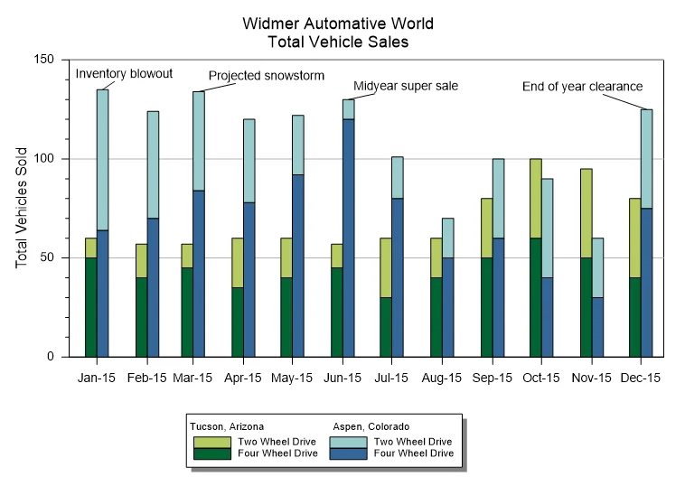
The Stacked and Adjacent Bar Chart blends two comparison methods into a single, unified visual. In this template, vehicle sales are organized by month, location, and drive type. Each month features two side-by-side bars: one for Tucson, Arizona, and one for Aspen, Colorado. Within each bar, totals are stacked to separate two-wheel drive and four-wheel drive sales. This layered design equips you to evaluate the overall totals and category breakdowns at the same time.
The adjacent grouping also provides a clear path to compare total sales between locations for each month, while the stacked segments reveal how those totals are divided by drive type. Rather than forcing a choice between comparing totals or understanding composition, this format delivers both perspectives in one view.
With this template, annotations like “Inventory blowout,” “Projected snowstorm,” and “Midyear super sale” add helpful context to spikes or shifts in sales. It’s a strong reminder that bar charts can go beyond displaying data by also telling the story behind the trends.
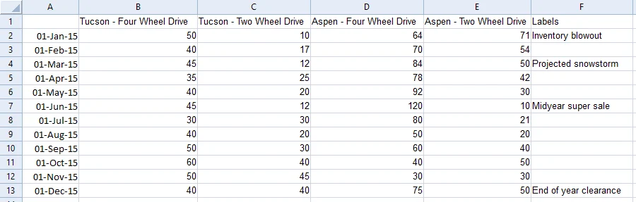
The data for this template can be found below which you can download and adjust using your own data:
Industry Focus: Retail, Sales, Operations Reporting, Analysis, Business, Healthcare, Finance, Agriculture, Public Policy, Supply Chain Management
Graph Features: Bar
Instructions
To use this template in Grapher:
- For the best experience, structure your data in the same format shown on this page or use the example files if provided above.
- Click Download Template at the top of this page to download a GRT template file.
- In Grapher, click File | Open and open the file.
- Click Template | Populate Template to load your own data into the template.
Primary Categories: Categorical, Comparison, Relational
Industry Focuses: Agriculture, Analysis, Business, Finance, Healthcare, Operations Reporting, Public Policy, Retail, Sales, Supply Chain Management
Type: Bar