Annual Mean Temperature
Grapher Template by Golden Software
194
523
Annual Mean Temperature
(Template by Golden Software).grt
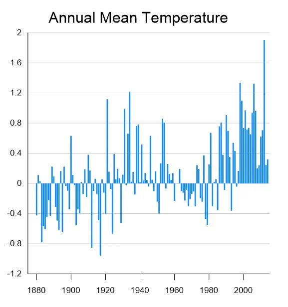
This chart visualizes annual global temperature anomalies, showing how each year’s mean air temperature deviates from a long-term average (baseline). Positive bars indicate warmer-than-average years, while negative bars represent cooler-than-average years. This kind of chart is commonly used in climate science to illustrate global warming trends over time, and is useful when you want to show the trend in changes around a particular value (in this case zero).
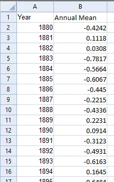
The data for this template can be found below which you can download and adjust using your own data:
Industry Focus: Agriculture, Climate Science, Education, Environmental Science
Graph Features: Bar
Instructions
To use this template in Grapher:
- For the best experience, structure your data in the same format shown on this page or use the example files if provided above.
- Click Download Template at the top of this page to download a GRT template file.
- In Grapher, click File | Open and open the file.
- Click Template | Populate Template to load your own data into the template.
Primary Categories: Relational, Temporal
Industry Focuses: Agriculture, Climate Science, Education, Environmental Science
Type: Bar