Causes of Attrition
Grapher Template by Golden Software
139
551
Causes of Attrition
(Template by Golden Software).grt
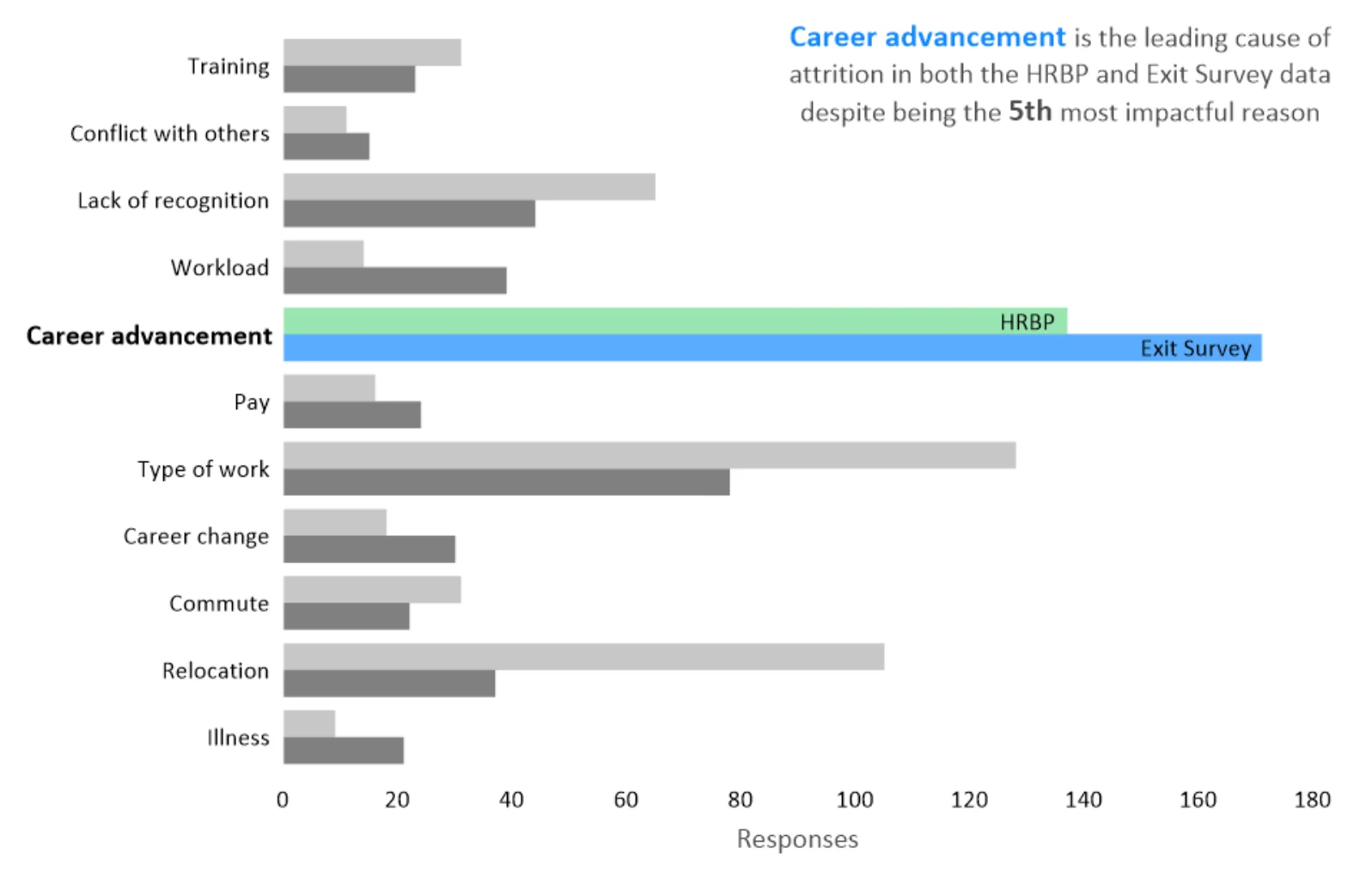
This graph is a powerful example of how data visualization can uncover key insights with clarity and impact. Designed for easy understanding, it uses color thoughtfully—green for HRBP responses and blue for Exit Survey responses—making it simple to distinguish between data sets. The main takeaway is also clear: while the company assumed training was driving attrition, both HRBP and Exit Survey data reveal a different story. Career advancement, not training, is the top reason employees are leaving. This contrast highlights a crucial insight that may encourage the company to revisit its retention strategies. With a clean, clutter-free design, this graph combines copy and visuals to tell a compelling, data-driven story that challenges assumptions and suggests a fresh approach to employee retention.
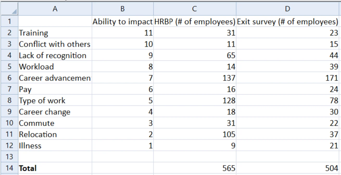
The data for this template can be found below which you can download and adjust using your own data:
Industry Focus: Business
Graph Features: Bar
Instructions
To use this template in Grapher:
- For the best experience, structure your data in the same format shown on this page or use the example files if provided above.
- Click Download Template at the top of this page to download a GRT template file.
- In Grapher, click File | Open and open the file.
- Click Template | Populate Template to load your own data into the template.
Primary Categories: Comparison
Industry Focuses: Business
Type: Bar