Flood Sediment Transport and Deposition Analysis
Grapher Template by Golden Software
159
575
Flood Sediment Transport and Deposition Analysis
(Template by Golden Software).grt
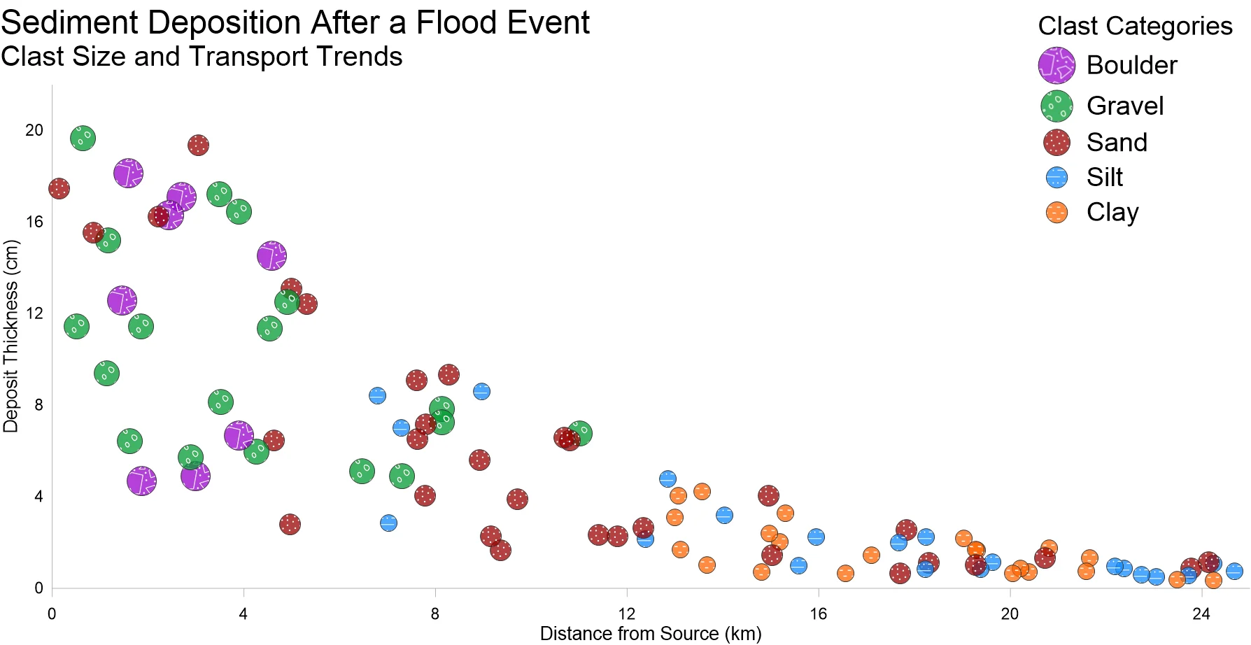
A Class Scatter Plot visualizing categorized data points across two numerical variables, effectively illustrating patterns, trends, and relationships within grouped datasets. The x-axis represents one continuous variable, while the y-axis represents another, with data points color-coded by class to distinguish different categories. This visualization is widely used in various fields, including scientific research, business analytics, engineering, and social sciences, to analyze distributions, identify correlations, and compare class-based trends.
The data for this template can be found below which you can download and adjust using your own data:
Industry Focus: Business, Data Science, Engineering, Environmental Science, Finance, Geoscience, Marketing, Social Science, Supply Chain Management
Graph Features: Class, Scatter
Instructions
To use this template in Grapher:
- For the best experience, structure your data in the same format shown on this page or use the example files if provided above.
- Click Download Template at the top of this page to download a GRT template file.
- In Grapher, click File | Open and open the file.
- Click Template | Populate Template to load your own data into the template.
Primary Categories: Distributive, Spatial
Industry Focuses: Business, Data Science, Engineering, Environmental Science, Finance, Geoscience, Marketing, Social Science, Supply Chain Management
Type: Class, Scatter