Heat Map
Grapher Template by Golden Software
287
586
Heat Map
(Template by Golden Software).grt
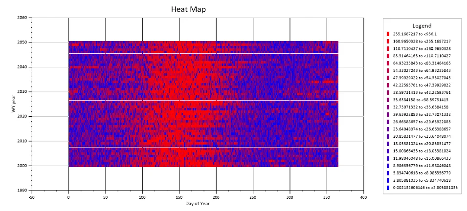
This heatmap offers a powerful visual representation of data within a matrix, where the intensity of color in each cell corresponds to a specific quantitative value. It’s an excellent tool for quickly identifying patterns, correlations, and outliers across two categorical or ordered dimensions. By presenting data in a grid, with row and column labels defining two dimensions and the cell’s color representing a third, quantitative dimension, heatmaps make complex datasets more digestible at a glance and facilitate the rapid identification of hot spots and cold spots.
To adjust the gaps or overlaps you may see by a variation in your data density from the template’s, do the following after populating with your data:
- Select the Flow plot (class scatter)
- In the Property Manager, on the Plot tab, click Classes | Edit…
- To change the shape of the symbol, click Classes symbol… Here you can select from a variety of rectangle shapes that best form a grid for your data
- To change the size of the symbol, click Symbol sizes… Here you can increase or decrease the default size depending on what you need
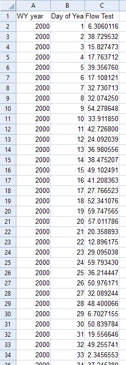
The data for this template can be found below which you can download and adjust using your own data:
Industry Focus: Analysis, Demographics, Environmental Science, Geology, Manufacturing, Materials Science, Metallurgy, Meteorology, Oil and Gas
Graph Features: Class, Scatter
Instructions
To use this template in Grapher:
- For the best experience, structure your data in the same format shown on this page or use the example files if provided above.
- Click Download Template at the top of this page to download a GRT template file.
- In Grapher, click File | Open and open the file.
- Click Template | Populate Template to load your own data into the template.
Primary Categories: Unknown
Industry Focuses: Analysis, Demographics, Environmental Science, Geology, Manufacturing, Materials Science, Metallurgy, Meteorology, Oil and Gas
Type: Class, Scatter