Return on Investment
Grapher Template by Golden Software
145
512
Return on Investment
(Template by Golden Software).grt
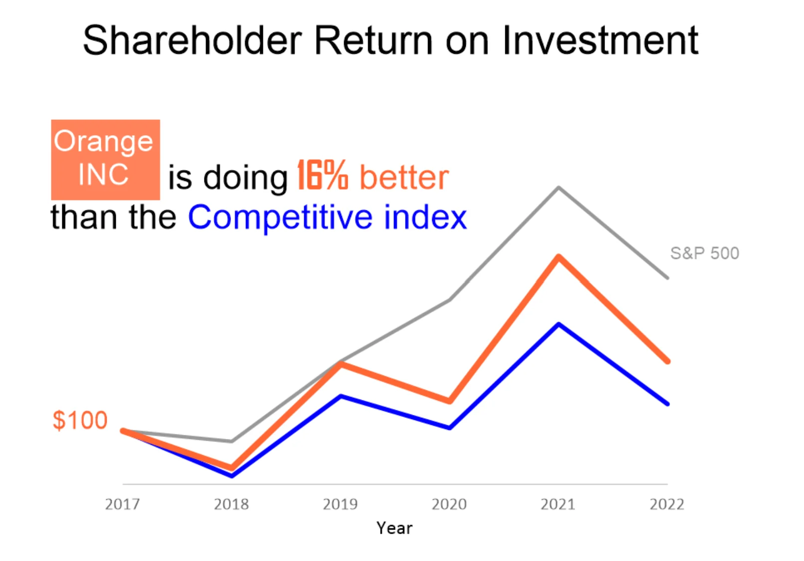
This graph is a textbook example of clear, impactful data visualization. Designed for universal understanding, it uses color intentionally—Orange Inc. in bold orange, the Competitive Index in blue, and the less relevant S&P 500 in subtle gray—to guide the viewer’s focus. The main story, “Orange Inc. is doing 16% better than the Competitive Index,” is reinforced with a mix of copy and visuals, ensuring the takeaway is instantly clear. Clean, clutter-free, and memorable, this graph tells a compelling story of Orange Inc.’s outperformance over time.
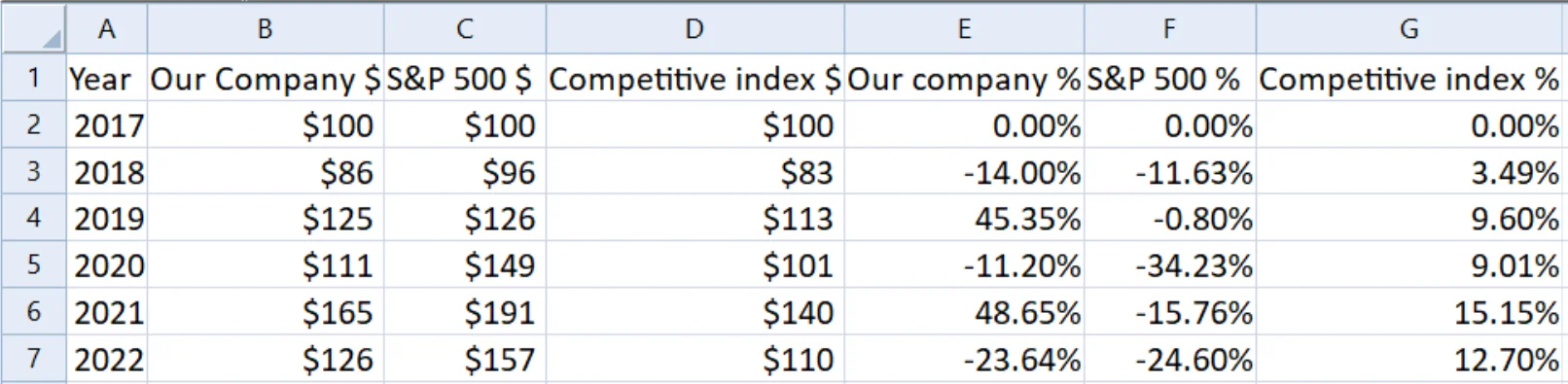
The data for this template can be found below which you can download and adjust using your own data:
Industry Focus: Finance, Healthcare, Marketing, Retail, Technology
Graph Features: Line
Instructions
To use this template in Grapher:
- For the best experience, structure your data in the same format shown on this page or use the example files if provided above.
- Click Download Template at the top of this page to download a GRT template file.
- In Grapher, click File | Open and open the file.
- Click Template | Populate Template to load your own data into the template.
Primary Categories: Comparison, Temporal
Industry Focuses: Finance, Healthcare, Marketing, Retail, Technology
Type: Line