Statistical Process Control Chart
Grapher Template by Golden Software
190
556
Statistical Process Control Chart
(Template by Golden Software).grt
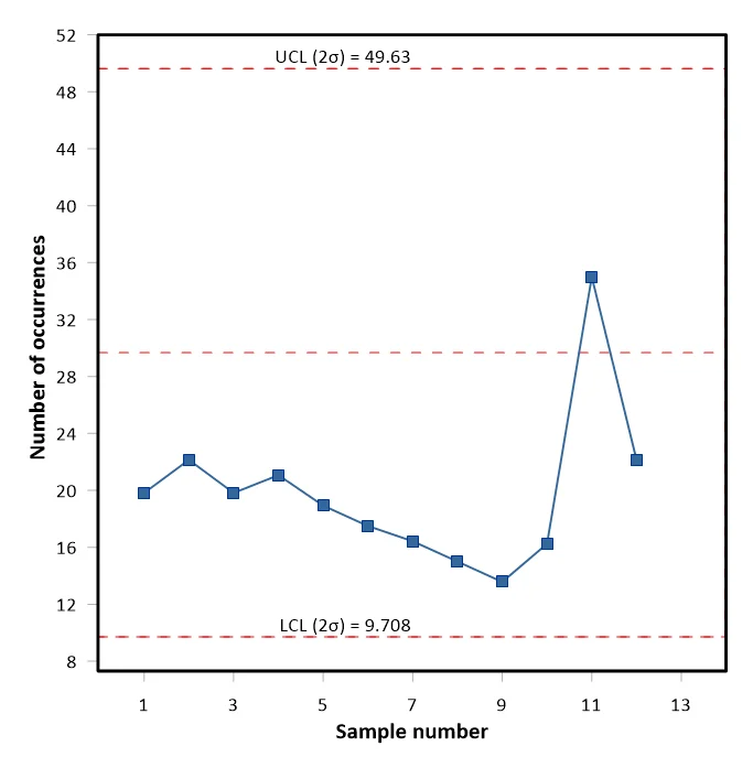
A Statistical Process Control (SPC) chart is a graph that shows how data changes over time. It’s a tool used to monitor process performance and improve quality. A control chart always has a central line for the average, an upper line for the upper control limit, and a lower line for the lower control limit. These lines are determined from historical data. By comparing current data to these lines, you can draw conclusions about whether the process variation is consistent (in control) or is unpredictable (out of control, affected by special causes of variation). This can be used in a variety of applications such as determining if a process is stable, predicting the expected range of outcomes, or analyzing patterns of process variation.
To change the number of standard deviations used away from the mean, in Grapher, select the Control limits plot and in the Property Manager, on the Plot tab, adjust the Box edges and Whiskers #deviations from mean value.
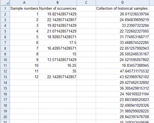
The data for this template can be found below which you can download and adjust using your own data:
Industry Focus: Healthcare, Manufacturing
Graph Features: Box, Line, Scatter
Instructions
To use this template in Grapher:
- For the best experience, structure your data in the same format shown on this page or use the example files if provided above.
- Click Download Template at the top of this page to download a GRT template file.
- In Grapher, click File | Open and open the file.
- Click Template | Populate Template to load your own data into the template.
Primary Categories: Comparison, Statistical
Industry Focuses: Healthcare, Manufacturing
Type: Box, Line, Scatter