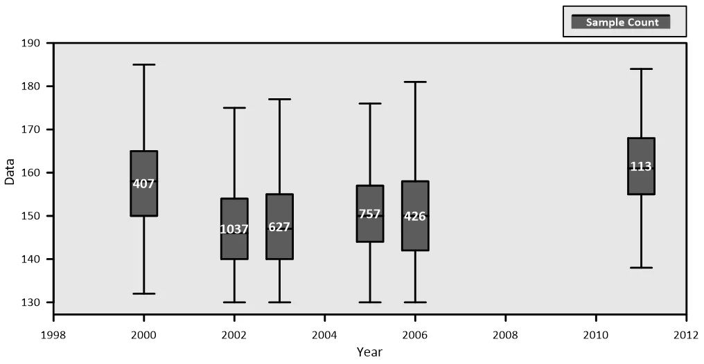
Time Series Box Plot
Grapher Template by Golden Software
181
611
Time Series Box Plot
(Template by Golden Software).grt
This box plot takes advantage of the grouping feature in Grapher to display box plots at particular locations on the X Axis. In this example, we don’t have data for all years, and can easily visualize which years we have data for, how the distribution stacks up against the other years, and which years are missing. This can be really helpful when analyzing and comparing data sets to each other on a timeline or other interval.
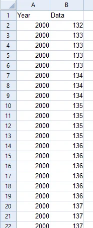
The data should be arranged in two columns as shown below where one column has the timeline or interval data, and the other column has the sample data associated with the time/interval.
The data for this template can be found below which you can download and adjust using your own data:
Industry Focus: Chemistry, Data Science, Environmental Science, Healthcare, Research, Statistics
Graph Features: Box
Instructions
To use this template in Grapher:
- For the best experience, structure your data in the same format shown on this page or use the example files if provided above.
- Click Download Template at the top of this page to download a GRT template file.
- In Grapher, click File | Open and open the file.
- Click Template | Populate Template to load your own data into the template.
Primary Categories: Categorical, Comparison, Distributive, Statistical
Industry Focuses: Chemistry, Data Science, Environmental Science, Healthcare, Research, Statistics
Type: Box