Travel Trends
Grapher Template by Golden Software
130
510
Travel Trends
(Template by Golden Software).grt
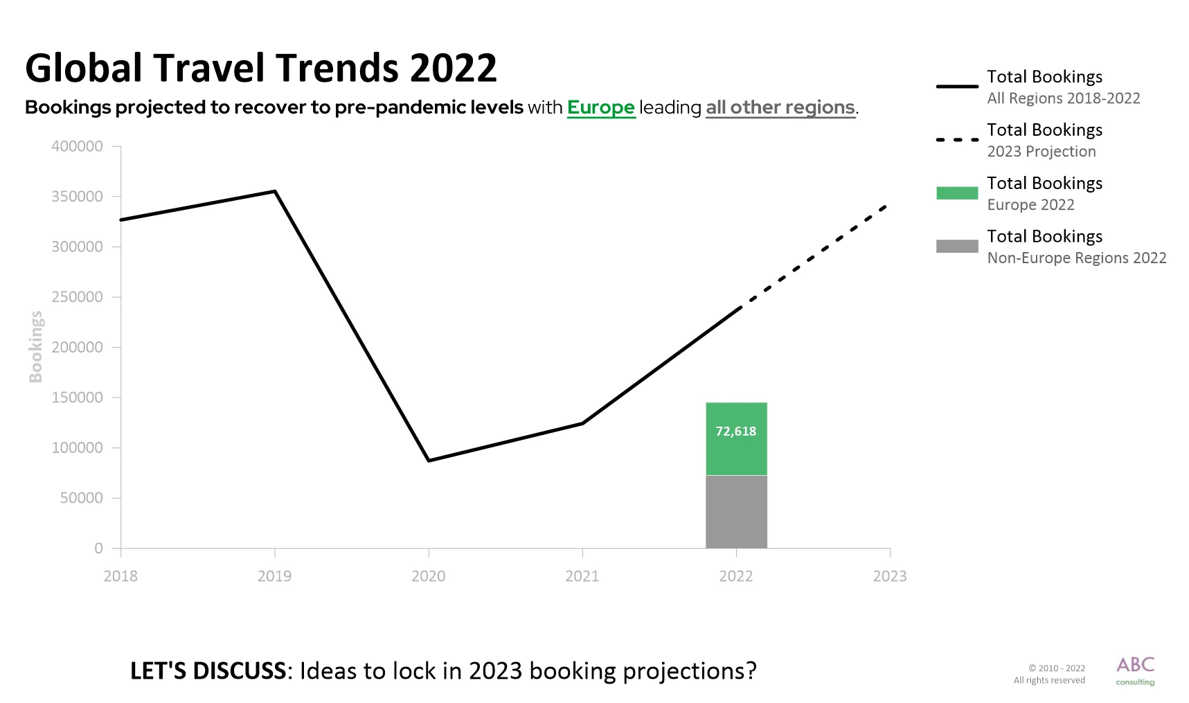
This graph is a standout example of clear, engaging data visualization designed for decision-making. Simple and uncluttered, it uses green to spotlight Europe as the leader in booking recovery post-pandemic. The upward trend since 2020’s dip is immediately clear, with supporting text noting the return to pre-pandemic levels. A question at the bottom—“Ideas to lock in 2023 booking projections?”—also adds an interactive touch, prompting stakeholders to consider next steps. Overall, this graph tells a story about the travel industry’s recovery, while simultaneously highlighting Europe’s growth and inspiring action.
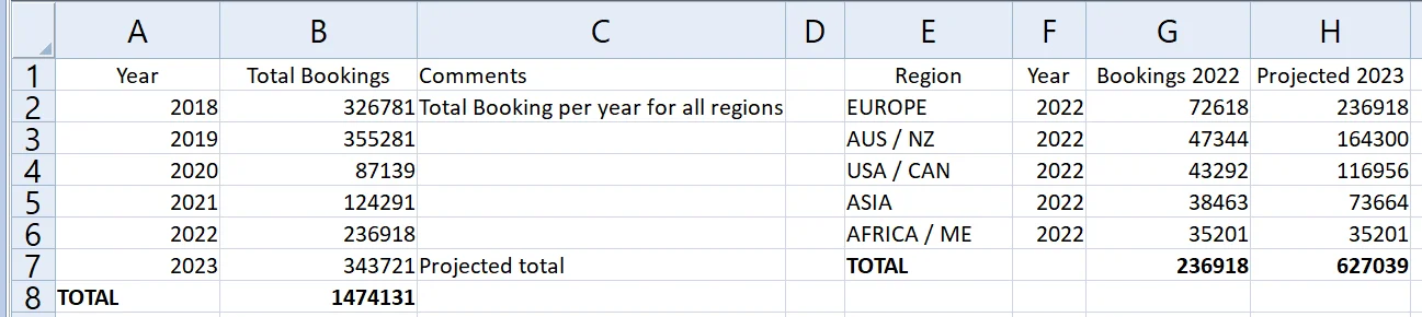
The data for this template can be found below which you can download and adjust using your own data:
Industry Focus: Finance, Manufacturing, Marketing, Retail
Graph Features: Bar, Line
Instructions
To use this template in Grapher:
- For the best experience, structure your data in the same format shown on this page or use the example files if provided above.
- Click Download Template at the top of this page to download a GRT template file.
- In Grapher, click File | Open and open the file.
- Click Template | Populate Template to load your own data into the template.
Primary Categories: Comparison, Temporal
Industry Focuses: Finance, Manufacturing, Marketing, Retail
Type: Bar, Line