Distribution Comparison
Grapher Template by Golden Software
157
532
Distribution Comparison
(Template by Golden Software).grt
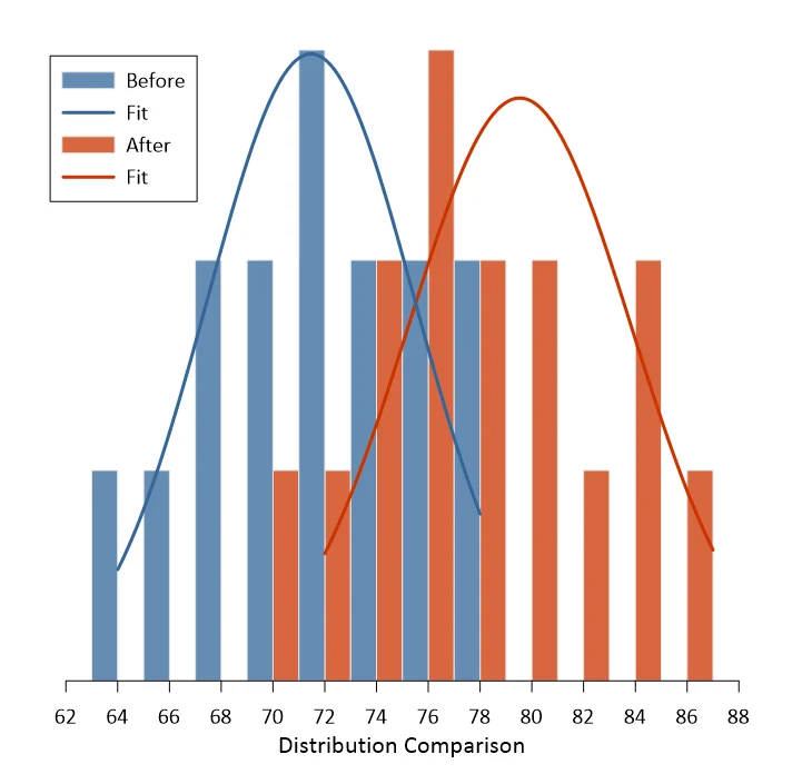
Comparing two data sets using histograms can be a great way to determine how the data sets relate to each other. In this example, two distributions are compared and the results clearly show a right shift for the ‘after’ distribution to indicate that measurements increased across the distribution for that data set. Plotting these on the same graph using adjacent histograms makes it easy to visualize how the distributions compare.
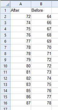
The data for this template can be found below which you can download and adjust using your own data:
Industry Focus: Climate Science, Data Science, Education, Engineering, Environmental Science, Finance, Healthcare, Manufacturing, Research, Statistics
Graph Features: Fit, Histogram
Instructions
To use this template in Grapher:
- For the best experience, structure your data in the same format shown on this page or use the example files if provided above.
- Click Download Template at the top of this page to download a GRT template file.
- In Grapher, click File | Open and open the file.
- Click Template | Populate Template to load your own data into the template.
Primary Categories: Comparison, Distributive, Trend
Industry Focuses: Climate Science, Data Science, Education, Engineering, Environmental Science, Finance, Healthcare, Manufacturing, Research, Statistics
Type: Fit, Histogram